

Distrialimentar: Naturally fresh.
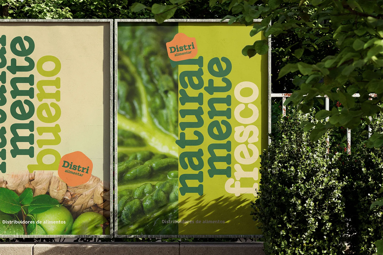
Distrialimentar is a food distributor. Its new identity takes the colors, shapes and energy of fresh produce to build a brand that feels approachable and is easy to recognize. We developed the logo, the color palette and a graphic system that works on packaging, print pieces and outdoor communication.
- Type
- Branding
- Program
- Identity®
- Model
- B2B

Project Overview
A brand in touch with everyday life.
Food distribution is present in markets, businesses and places where everything moves fast. Distrialimentar needed an identity that could keep up with that pace and be recognized across different formats. The starting point was the world of food itself: its colors, its variety and its freshness.
(Details)
- Type
- Branding
- Program
- Identity®
- Model
- B2B
- Industry
- Food
Project Challenge
Looking fresh without looking like everyone else.
We wanted to steer away from an identity that relied on obvious drawings of fruits or vegetables. The challenge was to give Distrialimentar personality with simple resources: a recognizable logo, colors that felt true to the sector and compositions that worked both up close and at large scale.
Method
Naturally fresh.
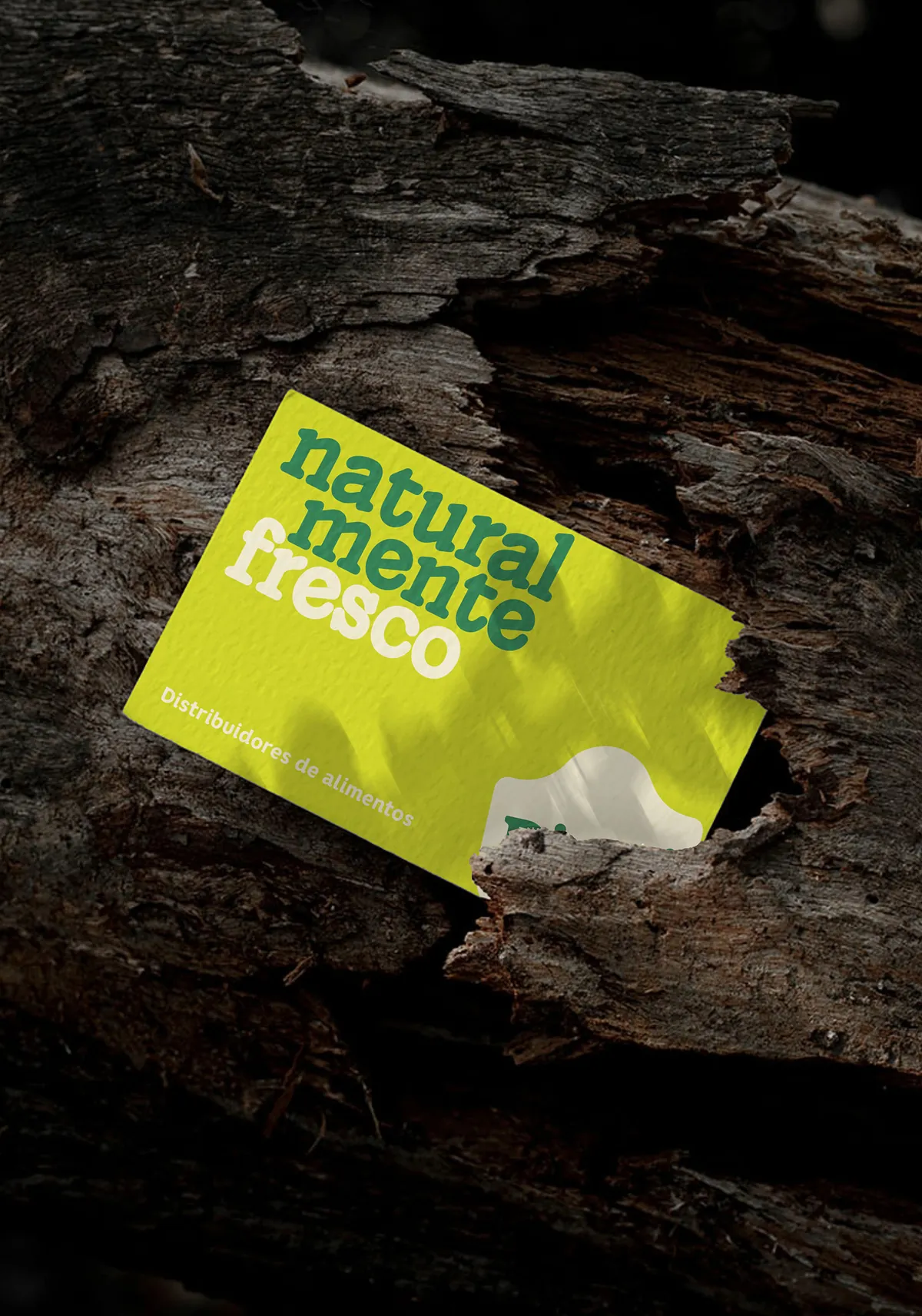
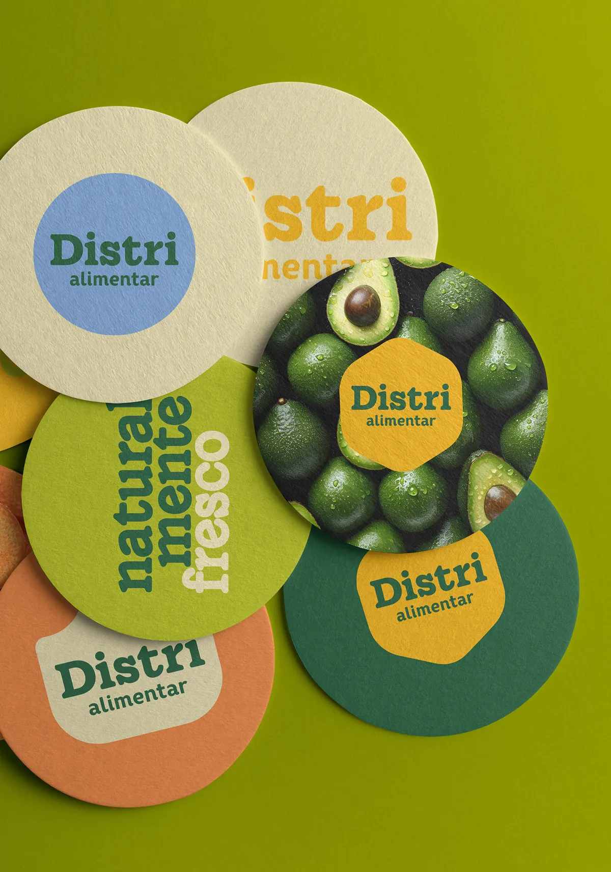
This phrase found its place within the identity as a visual resource. The words can fill an entire piece, sit alongside food photography or accompany the logo without competing with it. That way, the brand has more than one way to present itself while keeping the same personality.
Colors speak of freshness, too.
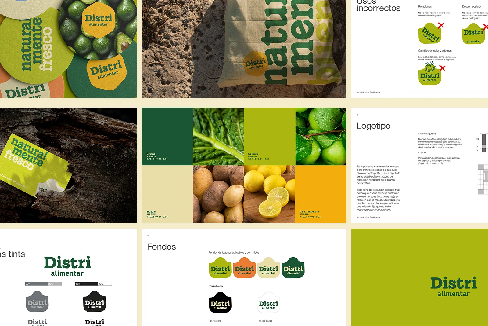
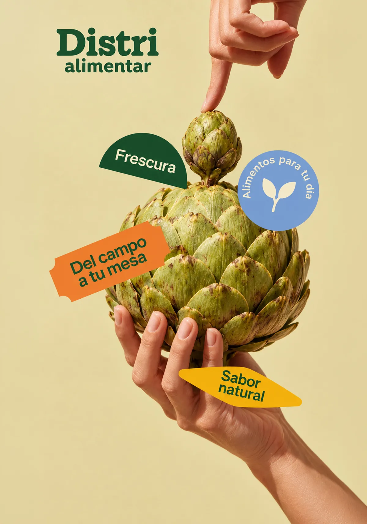
Deep green and lime green are the foundation. They are joined by cream, yellow, orange and a blue accent. Together they form a palette inspired by food, with enough contrast for the messages to stand out and for the applications to feel different without losing their connection to one another.
From paper to the street.
We took the system to bags, stickers, outdoor advertising, cards and stationery. Some pieces work with the logo; others let the words, photographs and color take up almost all the space. The identity adapts to the format instead of always repeating the same composition.
Deliverables
- Naming
- Identidad visual
- Logo design
- Aplicaciones
Solution & Result
A brand with many ways to show itself. Distrialimentar now has a defined visual system and a manual that brings together its usage rules. The logo, colors, typography and applications allow the brand to keep its personality in small pieces, print media and larger-scale formats.
Your business works, but does it have a brand that can grow with it?
We create names and visual systems that work at the point of sale, in operations and in communication.
Create my identityTell us what you need
- +57 319 215 4722
- Location
- Bucaramanga, Colombia