

Ozomed: A new way to talk about wellness.
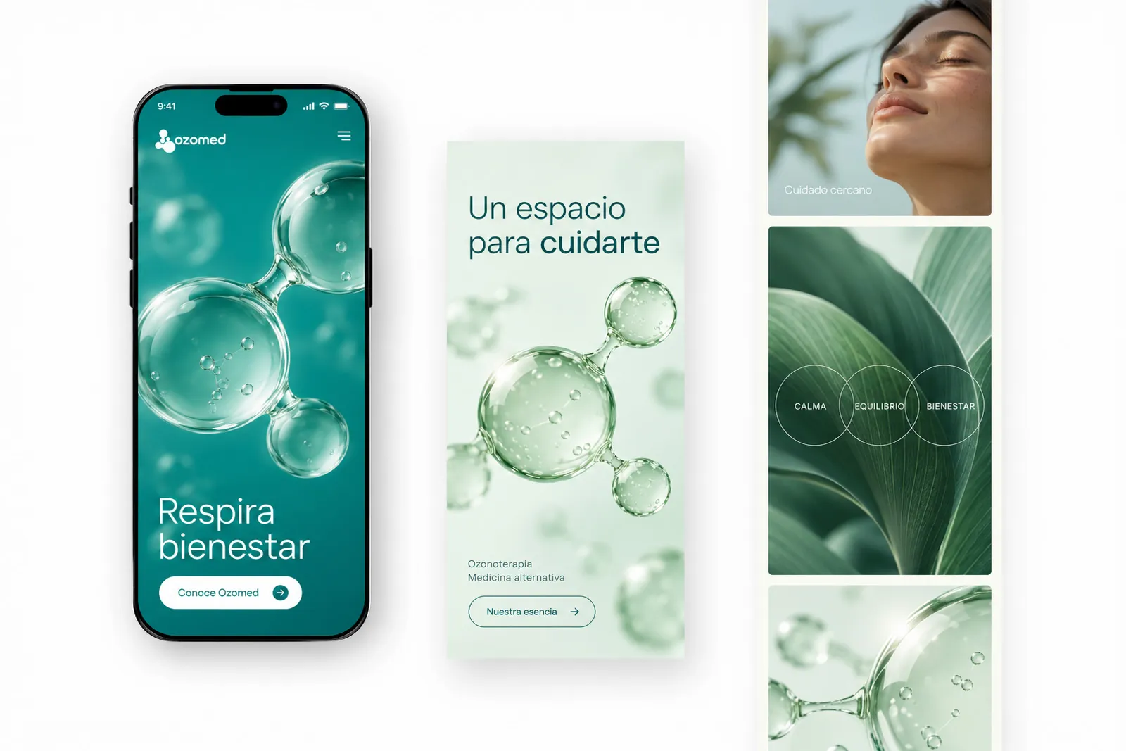
Ozomed is an ozone therapy and alternative medicine practice. For this project, we created the name and an identity that combines an approachable expression with a clean, contemporary visual language. The result brings together a symbol of organic shapes, a fresh palette and applications designed for the brand's communications.
- Type
- Branding
- Program
- Identity®
- Model
- B2C

Project Overview
Talking about health is also talking about closeness.
The brand operates in an environment where people need to understand who is caring for them and what services they will find. We wanted Ozomed to have a presence that is easy to recognize and a way of communicating without the rigid look often associated with some brands in the medical sector.
(Details)
- Type
- Branding
- Program
- Identity®
- Model
- B2C
- Industry
- Wellness
Project Challenge
Finding a name that sticks.
The project began with naming. We looked for a short name, easy to read and related to the practice's specialty. Ozomed combines two recognizable references from the brand's context: “ozo,” associated with ozone, and “med,” associated with medicine. From that foundation, we developed an identity that could support both clinical communications and wellness-oriented content.
Method
A palette that feels light.
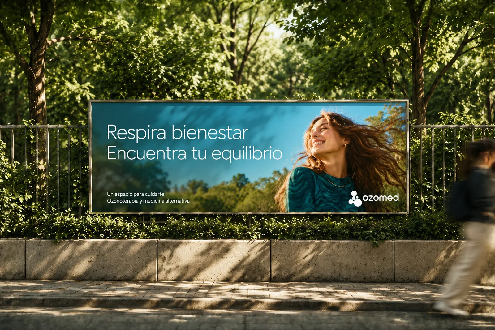
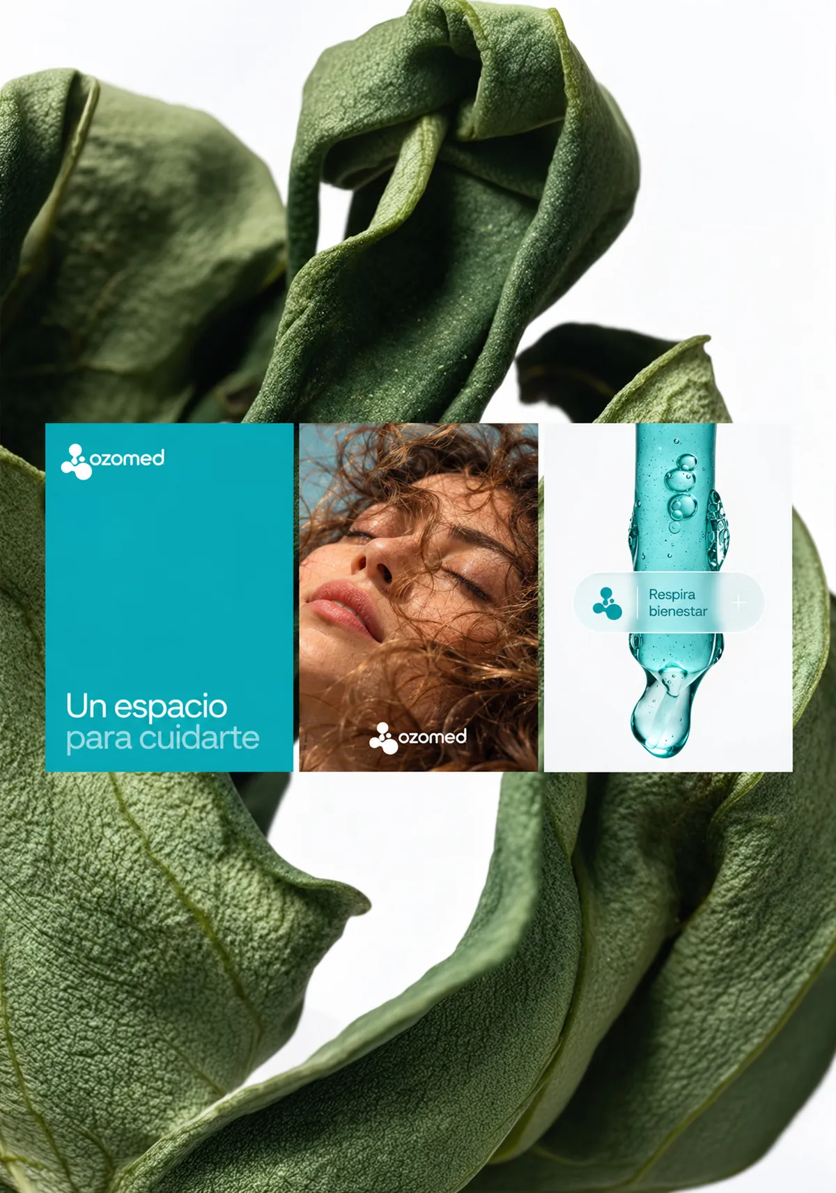
Turquoise green is the lead color, combined with light and neutral tones to leave room for photographs, copy and content. The identity seeks a balance between an aesthetic tied to health and a fresher, more accessible visual communication.
Shapes that connect.
The symbol brings together rounded figures of different sizes, joined in an organic composition. Its geometry suggests connection, movement and flow without literally depicting a treatment or a medical instrument. It is a simple shape that can be recognized on its own and accompany different messages.
A flexible symbol and a direct name.
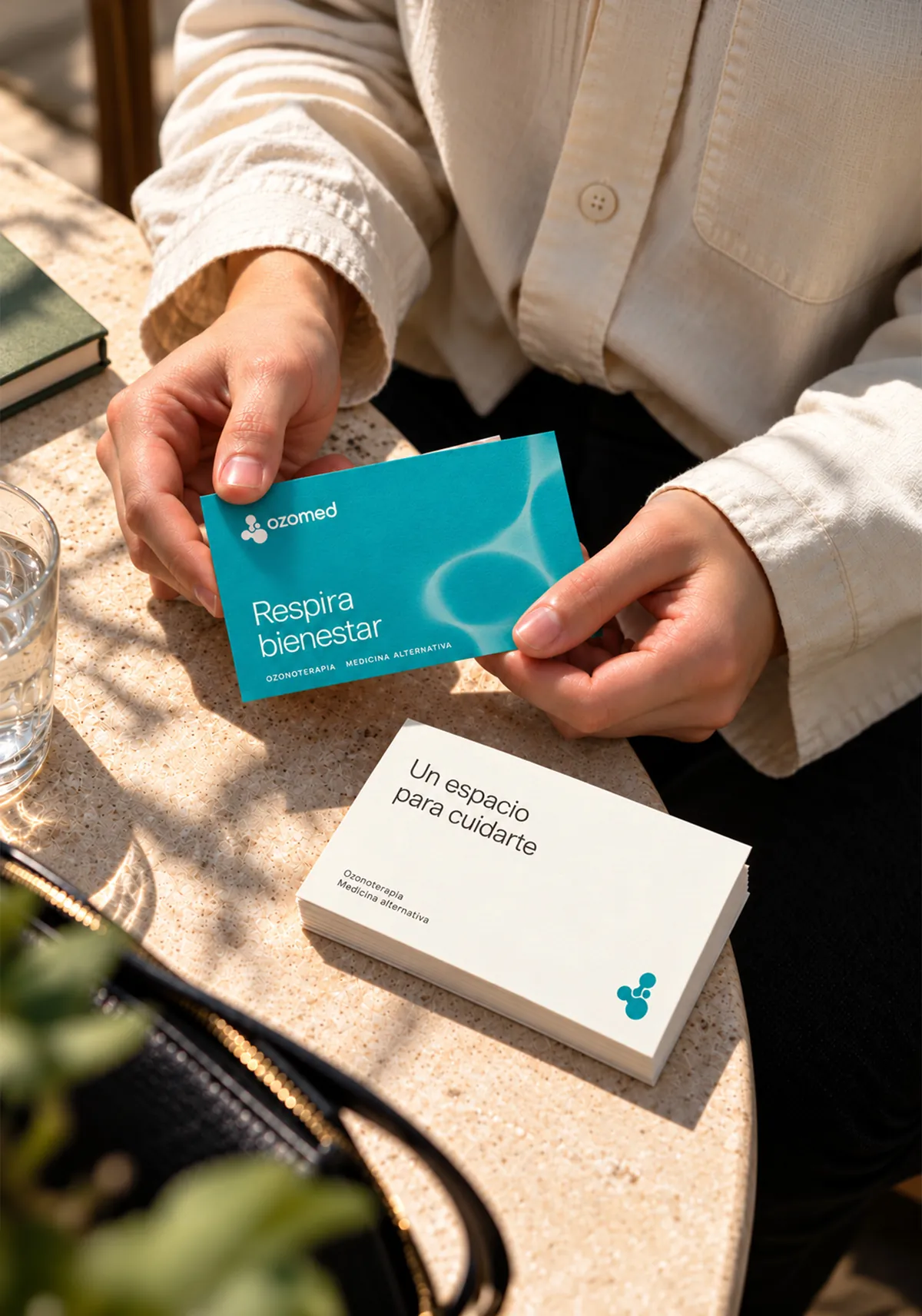
We developed a clearly legible logotype, paired with a symbol that can be used as a signature or as a graphic resource in larger compositions. That relationship allows the brand's presence to vary by format, from small pieces to larger-surface communications.
Solution & Result
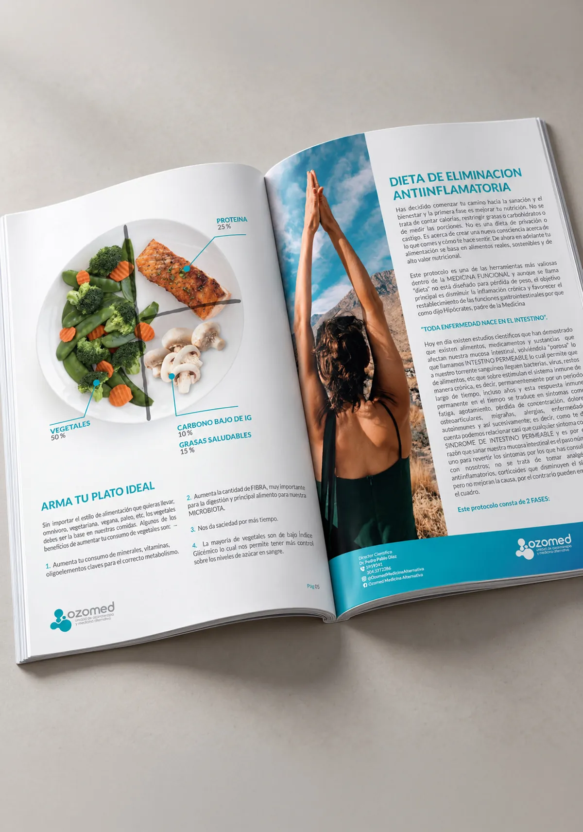
A name and an identity to get started. Ozomed now has a name, a logo and a visual foundation that can be carried into physical and digital formats. The applications developed show how the system can support its communication without depending on repeating exactly the same composition in every piece.
Let’s build something epic
- +57 319 215 4722
- Location
- Bucaramanga, Colombia